

From Screen to Page: Color Management for Perfect Printing
As our printing technology has gotten better, it’s easy to take color and color accuracy for granted. It seems that with one click of a button the images we captured land in our hands. But there’s so much more to it than that! Especially after careful effort to create an image with your camera and editing that has the best reproduction of the moment you experienced, you’ll want to make sure each translation of your image, as it moves across devices from screen to page, is as accurate to your vision as possible. Most of the time, we’re pleased with how they look, but sometimes it’s not quite right. That’s when it’s helpful to know more about the color management process, so you can troubleshoot.
Even though it’s usually easy, here are some things to keep in mind as you set up your pages.
5 THINGS TO REMEMBER FOR COLOR MANAGEMENT
1. There are multiple devices involved in image production. All digital images are captured data that needs rendering. But no device translates that digital information into an image exactly the same way. To create a print, you’ll have captured data with a camera, rendered it on a camera screen, then a monitor, and then exported the data to a printer who renders it in ink. To get the print to match the capture you created with your camera, you have to align all of these devices to express color data the same way.
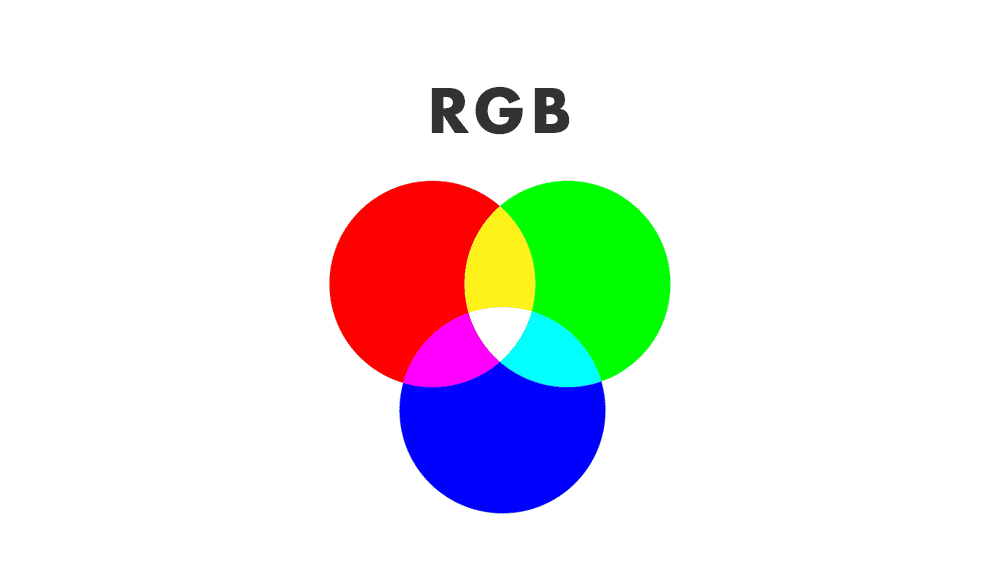
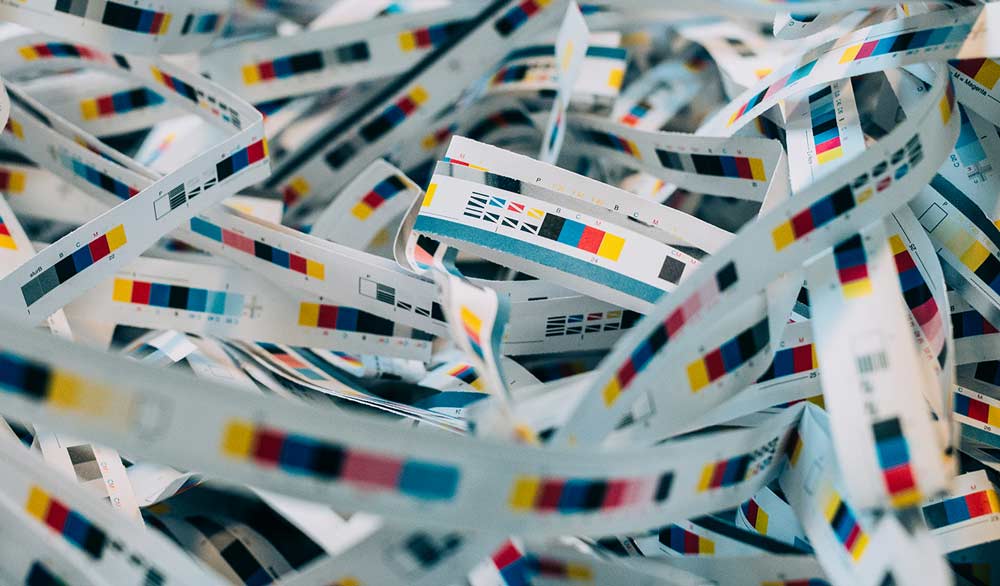
2. Color reproduction is both art AND science. The expression of color in the physical world is about adding or subtracting light. In the digital world it involves pixel composition. We use Red, Green, and Blue (RGB) to describe digital image colors, but we print with Cyan, Magenta, Yellow, and Black ink (CMYK).
Each pixel in a digital image is described by the amount of Red, Green, and Blue light that makes up its color. This is known as additive color since the total amount of RGB equals white. Most print devices use CMYK to mix and manage colors. Since the total combination of CMYK produces black, CMYK is subtractive color. The opposite of RGB. Printing is a subtractive color space because the color we see is reflected light, not the direct light seen when looking at a digital image.
When a digital image is printed, its RGB numbers are converted to CMYK numbers for the printer. This conversion will produce unexpected color if not done in a controlled and predictable manner. Overlay RGB and CMYK color spaces, and you’ll see that colors in RGB that do not have an exact equivalent in CMYK. This means that there are often colors on our monitors that cannot be reproduced perfectly in print. Through color management we pick the best possible CMYK color to match a given RGB color.
3. You’re moving from a digital space to a physical one. Printing is an art form that requires highly technical human expertise. There’s ink chemistry with pigment and binder, ink temperature, and physical chemistry in how ink and paper interact. Paper has attributes of its own—surface texture, density, size, color—that interact with ink, changing the way the ink behaves. All of this interaction—between ink and paper, between colors, between ink and machine, in the tiniest surface area—has an effect on the final look and feel of your physical, printed project.
4. Not all pixels are created equal. Print pixels (or dots) and digital pixels are different things. In the digital space, pixels indicates size; the print space, density. You’ll hear “Pixels Per Inch” (PPI) or “Dots Per Inch” (DPI), which is what Blurb uses. This is important because it describes resolution in a way that’s universal and doesn’t vary between devices.
The preferred DPI is 300, but you’ll see warnings in Blurb’s BookWright software if you’ve stretched your image to cover too many inches that falls below our standard of 250 DPI for our print projects. Printers use what’s called dithering to create the appearance of more colors than they actually use. This means that each dot will have within it multiple pixels of color. Each dot is created with an even smaller pattern of colored pixels. This is especially important for gradients and is why images require more DPI than PPI to depict the same level of detail.
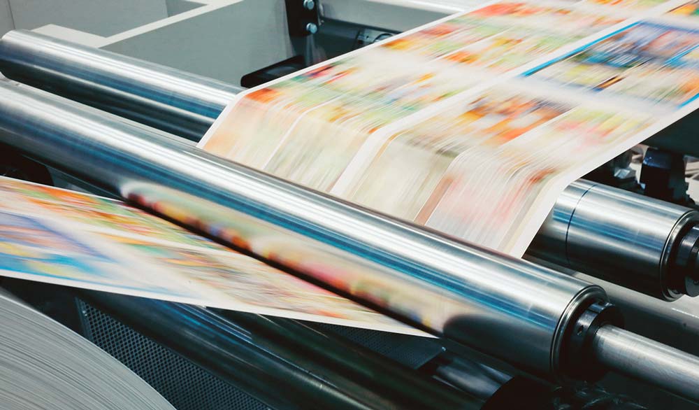
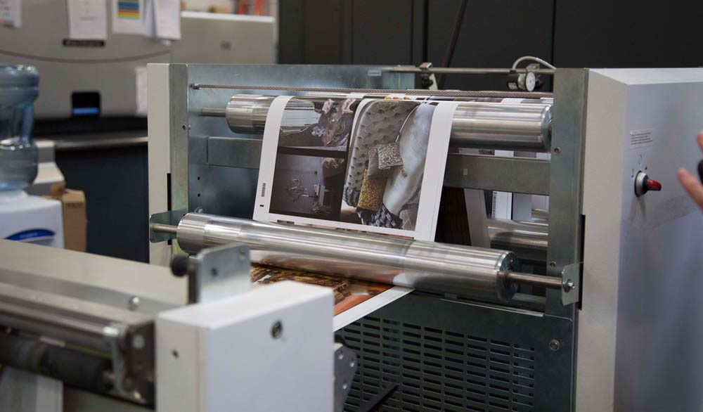
5. Printing is a technical, physical, multi-step process. Digital printing is still a mechanical process, and each machine is different. With ink jet printing, digital signals drive jets of ink droplets directly on to the paper. Offset printing transfers the image to a plate which then plate transfers the image to the paper. The process and the machines determine which types of ink are used, which determines color capabilities.
It’s important to remember that every mechanical process has its limitations. No matter how industrial the printer, it still faces fatigue and there are saturation constraints. Offset machines can incorporate Pantone spot colors, but this is outside the usual workflow and fairly expensive. Printing technology has come a long way in the last 15 years. But screens are still more capable of rendering precision detail and a wider range of colors. This is because they don’t require a complicated mechanical process and the color gamut of RGB is larger than the CMYK color gamut.
COLOR MANAGEMENT WITH BLURB
What is a Color Profile?
With all of these conversions from one color space to another, from one device to another, the color of an image would naturally appear differently on each. What a color profile does is describe what the colors will look like on a particular device whether it be a computer monitor, an ink-jet printer, or an HP Indigo printer. The color profile contains a Look-Up Table it uses when fed the data that describes a certain color on your monitor and converts it to the same color on a digital press.
The Blurb ICC Profile is based on the GRACoL2006 reference used in high-end commercial printing. Our entire print network adheres to this standard for the most consistent results possible with print on demand. By using this color profile, you can manage colors and soft proof your images while in RGB to see how they will look when printed, or use the profile to actually convert your images to the CMYK color space of the print device to eliminate the press-side conversion. This gives you more control over the images and how they will eventually print.
Monitor Calibration
A properly calibrated and profiled monitor is required in order to accurately edit color images. A variety of low-cost monitor profiling software/hardware bundles are available today. They include the X-Rite i1 Display Pro, Datacolor Spyder 5 Pro, and the Pantone ColorMunki. These packages are quick to install and the entire procedure often takes less than ten minutes. Monitors drift with usage and time, so we recommend monthly re-calibrations to ensure an accurate display.
A calibrated and profiled monitor allows you to view your images in CMYK, RGB, or Adobe RGB more accurately, and to soft proof your images. Soft proofing is a special preview feature in Adobe® Photoshop® and InDesign®. It allows you to see on your monitor how your images will print on a particular device. With a color-managed workflow, you can see how your images will reproduce on the HP Indigo using Blurb’s paper stock.
Photography Life offers an up-to-date how-to for monitor calibration for both Mac and PC systems.
App Calibration
Next, you need to be working in a color-profiled application. Color management works its digital magic by converting from one color space into another color space while preserving the closest possible color match. Color management requires an accurate description of the source color space and the destination color space. This description is known as an ICC profile.
ICC profiles are digital files that contain the color gamut information of a particular device or abstract color space such as RGB. Most ICC profiles are created by physically measuring the output of a device and then making sure to maintain the device in good working order so that its behavior doesn’t change from the readings.
The Blurb ICC Profile is based on the GRACoL2006 reference used in high-end commercial printing. Our entire print network adheres to this standard for the most consistent results possible with print on demand. Usually there are color profiles for each individual paper-type. Blurb has decided to have one “target” profile that all of our print devices are calibrated to.
To use the profile, you must download the Blurb ICC Profile. Check out our video that shows how to install the profile on either a Mac or PC.
Soft Proofing your images and making adjustments
Different tools have different processes, but the idea is to soft-proof your images during post-process in a CMYK color space before you put them into the layouts of your book.
FINAL THOUGHTS
It may seem complicated, but all of these steps are in an effort to control the multitude of variables that are part of the screen-to-print and color management process. These steps are in place to help advanced users—creative professionals who require the highest precision in rendering color—get their work with Blurb to meet their highest standards. For most users, color management isn’t necessary to produce a Blurb book that looks great.
This post doesn't have any comment. Be the first one!